
Stacked evidence
This week marks one year since the publication of our paper on the global human impact on biodiversity1. In that study, we brought together a very large body of ecological evidence to ask a broad question that, though simple, is particularly hard to answer.
Across ecosystems, taxa and human pressures, how are human activities impacting biodiversity?
In short, we found a clear signal of compositional change and a general decline in local diversity, but not a single universal pattern of homogenisation across all contexts. My aim in this post is not to revisit the article and its results in detail. Rather, I want to share an image that was generated during the analysis and give it some context. This image was not included in the publication, but I think it is perhaps more striking than any of the other graphs presented in the original article.
Stacking thousands of multivariate plots. Why not?
One of the things that defined this paper was the clear focus on beta-diversity, that is how community differ in composition, especially between reference and impacted sites. Ecologists typically present beta-diversity by plotting the dissimilarities between communities in two dimensions. The idea was therefore simply to compile as many beta diversity plots as possible in order to summarise them.
Simple, yes, but in practical terms, this meant for us manually extracting thousands of multivariate plots from the literature. That’s a lot of tedious work. But we managed, and in the end, we assembled 3,667 multivariate comparisons.
These comparisons came from very different studies, with their own taxa, sampling design, ecosystem, and context. Obviously, those analyses were never meant to sit together in one common ordination. Yet, at some point, it was clear to me that I wanted to stack them all to see what the aggregate picture might look like. After all, that is precisely the point of a meta-analysis: to pool data and re-analyse it together. So why not a meta-multivariate analysis?
Seeing it all at once
I won’t go into the technical details. The main idea is to standardise and rotate the various coordinate systems so that everything aligns in a coherent visualisation.
Then comes the moment that anyone who has analysed a new dataset knows. There’s a bit of excitement. You carefully craft your ggplot. Add your geoms. Blue for reference sites, red for impacted sites, ok. Then fix the few errors that are bound to crop up, and finally run the script. And there it is…
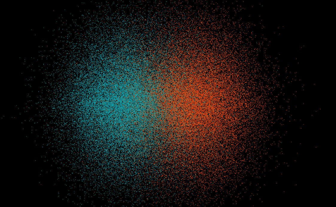
I remember looking at my screen and thinking: “Wow, this is probably the most comprehensive picture ever compiled of the impact of human activities on the composition of communities”. For a moment, and with all proportions respected, I felt a little like Katie Bouman, the computer scientist whose reaction to the first reconstructed black hole image became a meme. I’m not comparing the scale of science, but Katie Bouman has come to represent this rare moment when months or years of work resolve into an image that makes the result feel real. After all the hard work behind this project, I was here, finally looking at a picture that made the human impact on biodiversity tangible.

Striking picture, hard reality
Now back to reality, there is, of course, something sobering about seeing so many independent ecological studies line up into the same broad pattern.
I am an ecologist, I am well aware of the effects that human pressures can have on community composition, and I expected this effect to be observable. Yet I am still struck by this graph: the magnitude of the overall effect and its consistency across so many different systems. That’s the depressing part of the story.
Still, one reason we do this kind of synthesis, in biodiversity like in climate sciences, is precisely to make large-scale and global patterns harder to ignore. No single local study can show the whole picture, but a synthesis like ours can approach it. I don’t think evidence alone will fix the problem, but my hope is that this work, among others, helps make the scale and consistency of our impact harder to dismiss.
- Keck, F., Peller, T., Alther, R. et al. The global human impact on biodiversity. Nature 641, 395–400 (2025). https://doi.org/10.1038/s41586-025-08752-2 ↩︎